
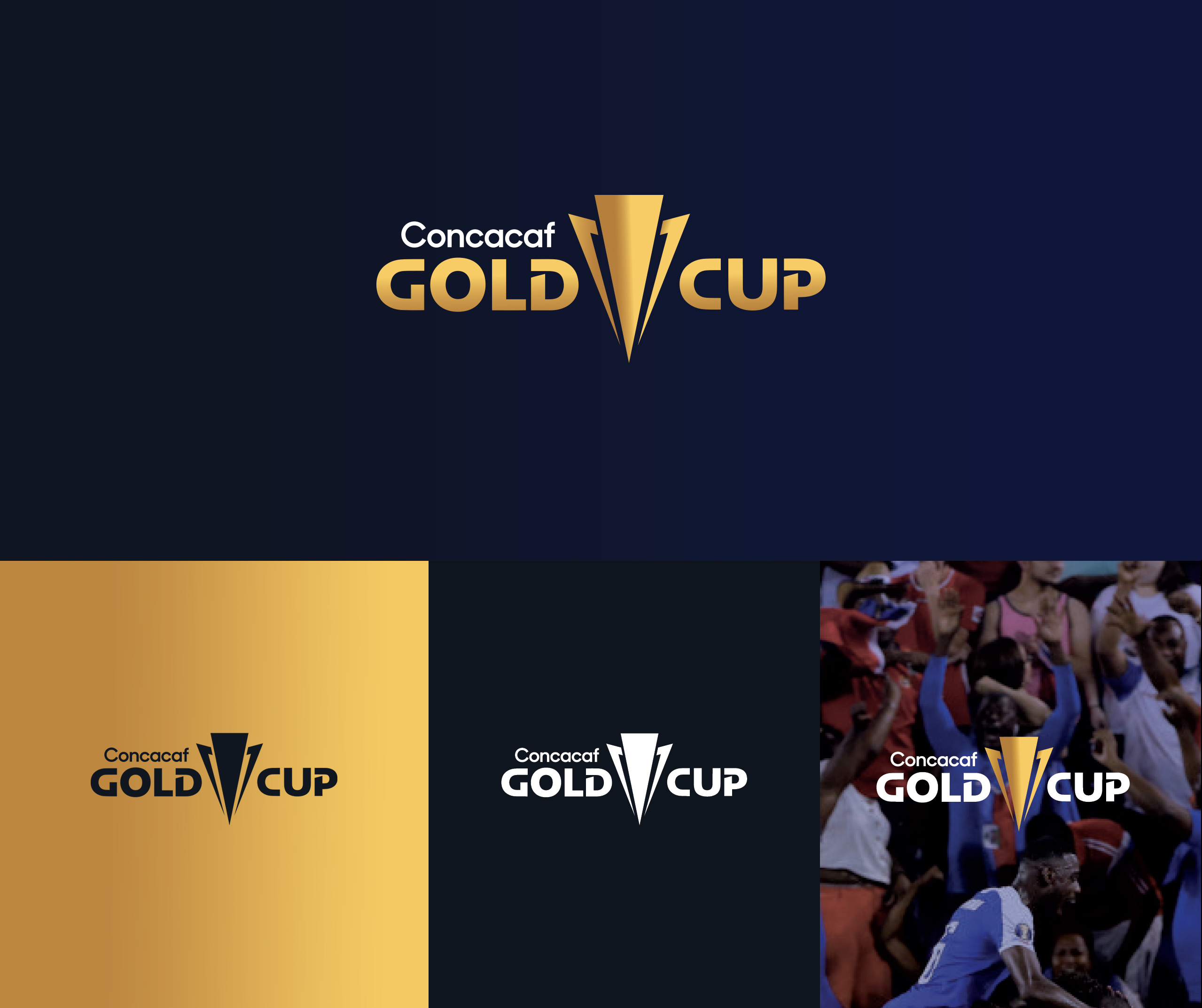
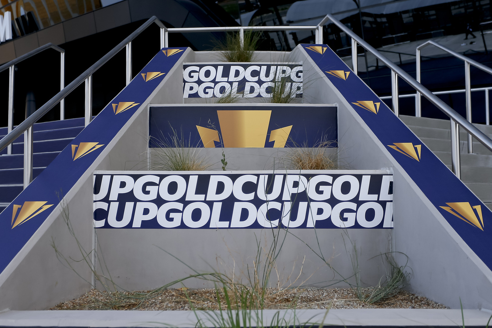
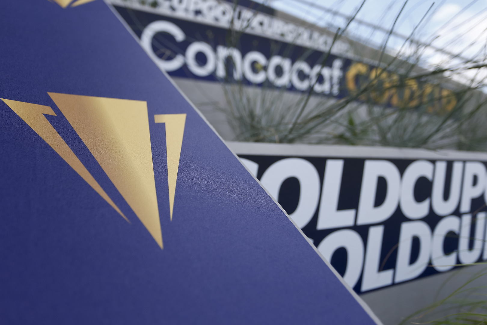
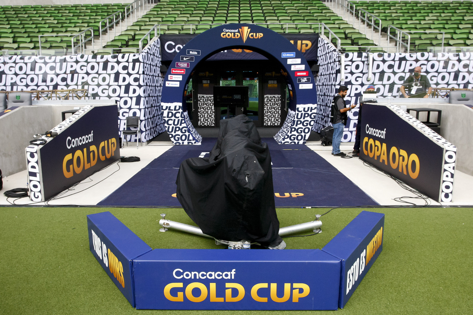
GOLD CUP
Branding
THE CONCACAF GOLD CUP
As the Gold Cup brand neared its 30 year anniversary, Concacaf’s focus moved to modernize the historic brand that has helped evolve soccer in the northwestern hemisphere. Our team was approached by the Concacaf brand team with the opportunity to do just that. Modernize an iconic brand without losing its established brand equity.


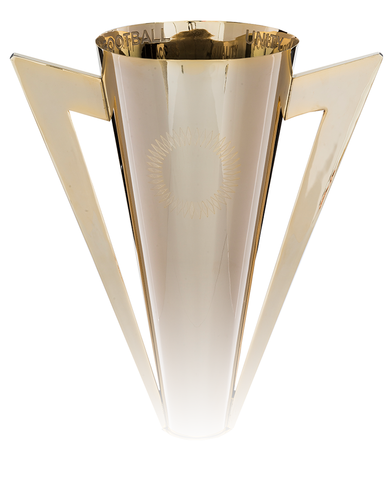

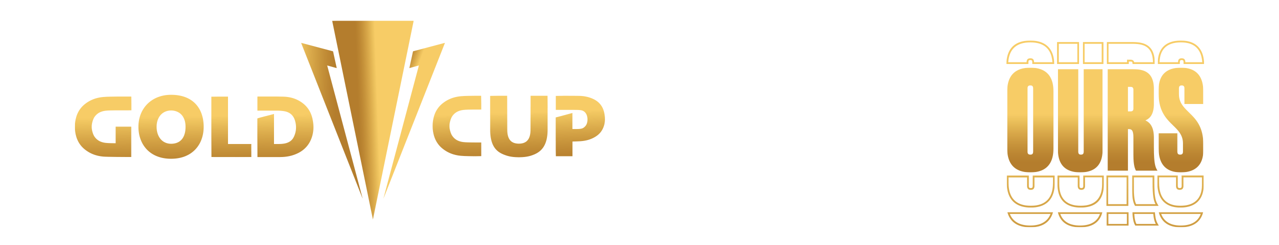
SCULPTED FROM GOLD
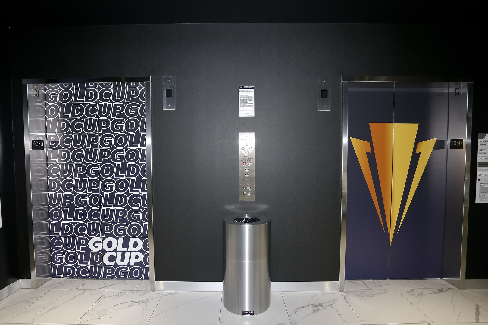
the cup itself, literally exemplifies the tournament name, and is a reflection of the tournament’s place in global soccer. With this being the center point of influence, we took to discovering the sleeker parts of the logo that were still iconically impactful. The unique V shape of the trophy handles was a standout characteristic that we believed could be expanded upon and used in more flexible creative environments. Thus the sleeker, more trimmed version of the prestigious trophy was born.
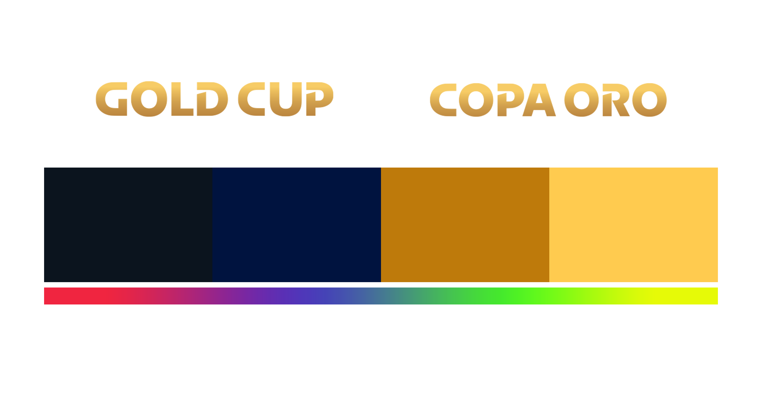
BEYOND THE LOGO
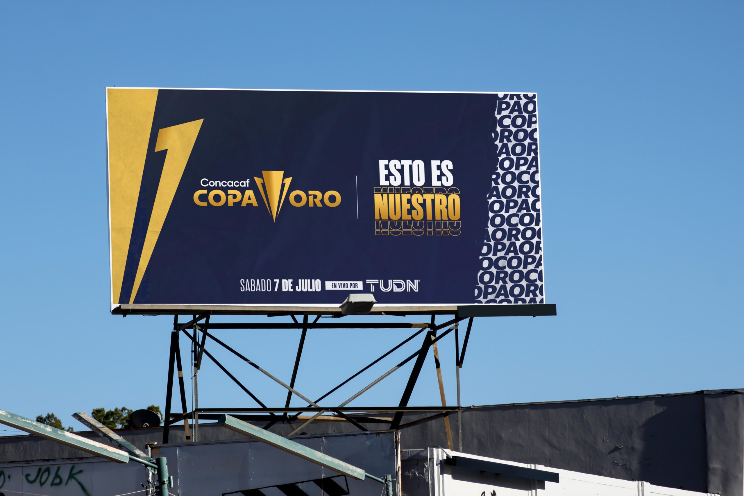
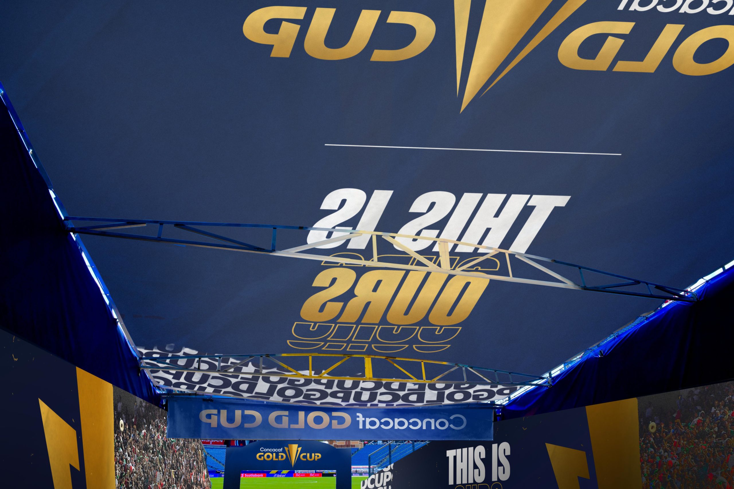
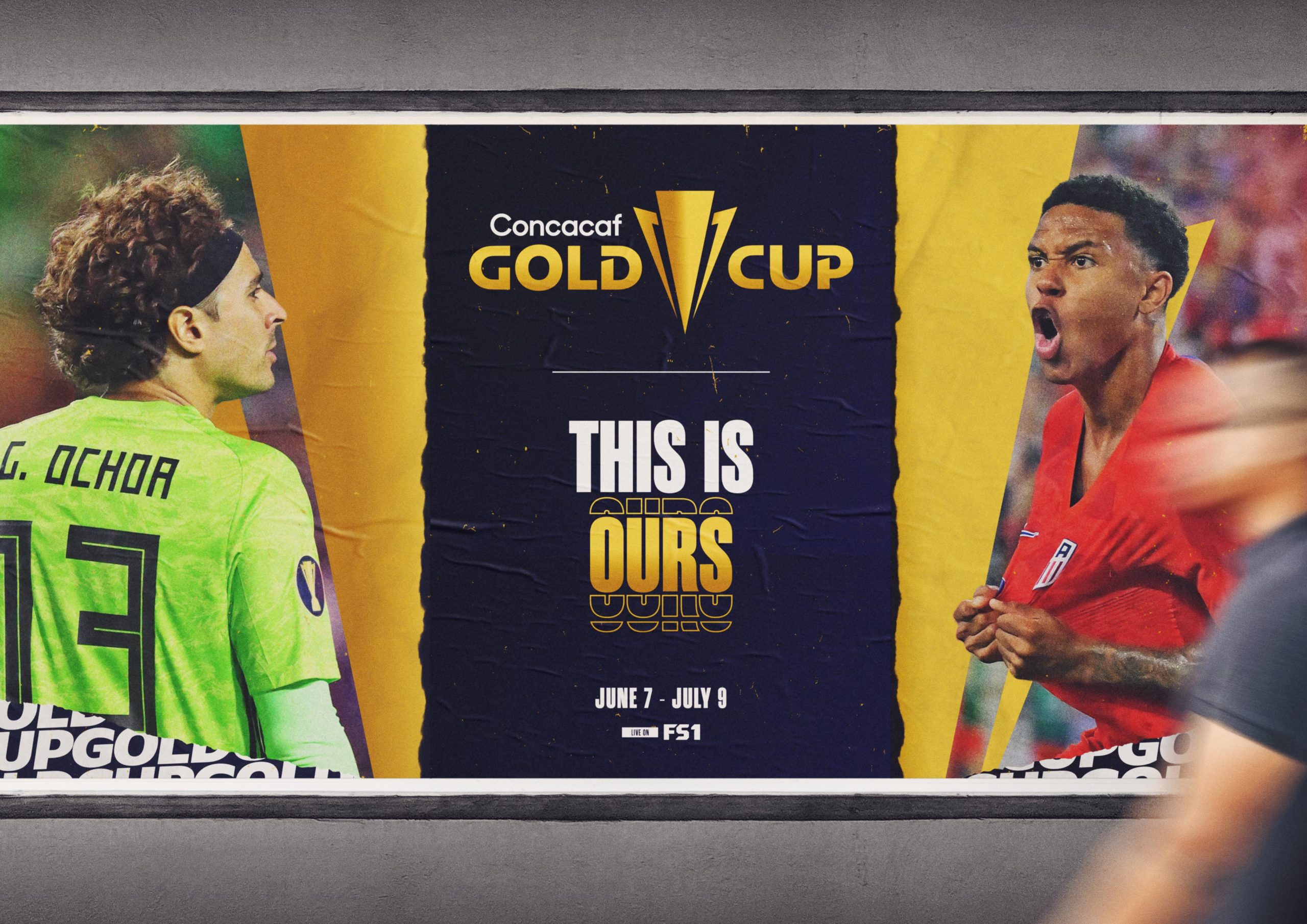
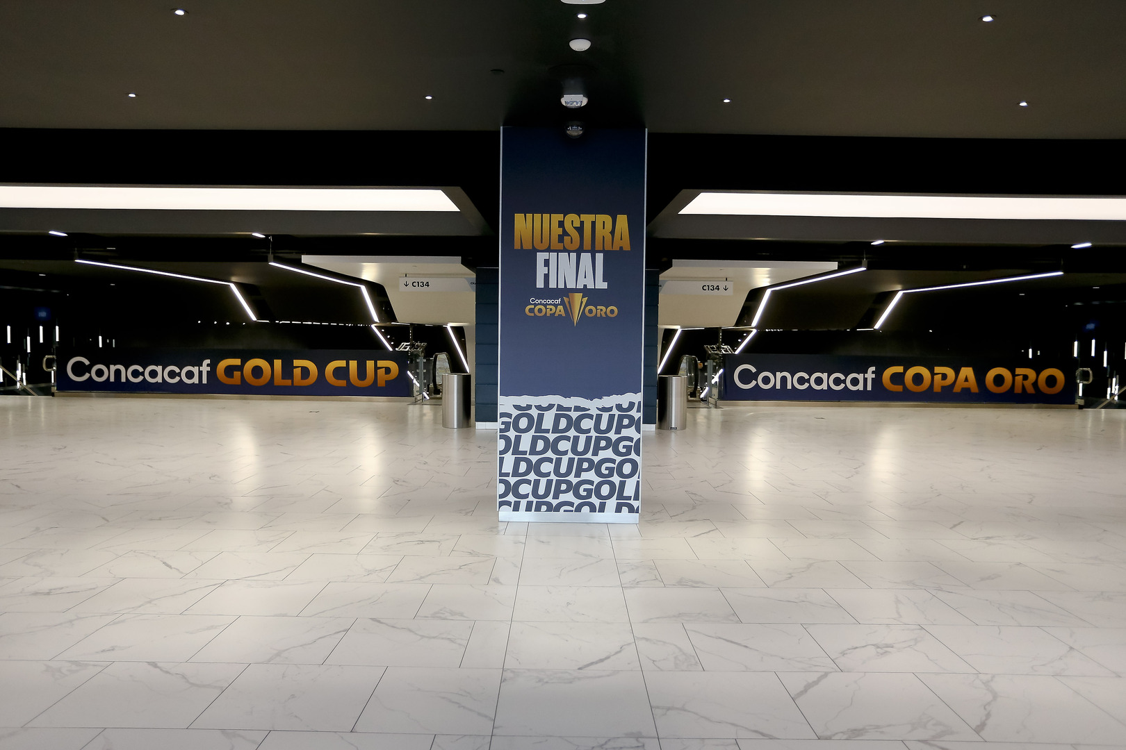
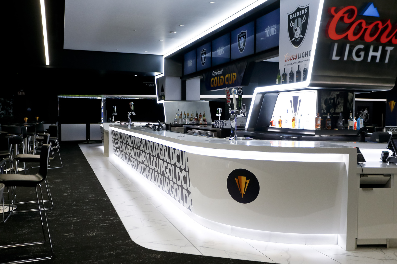
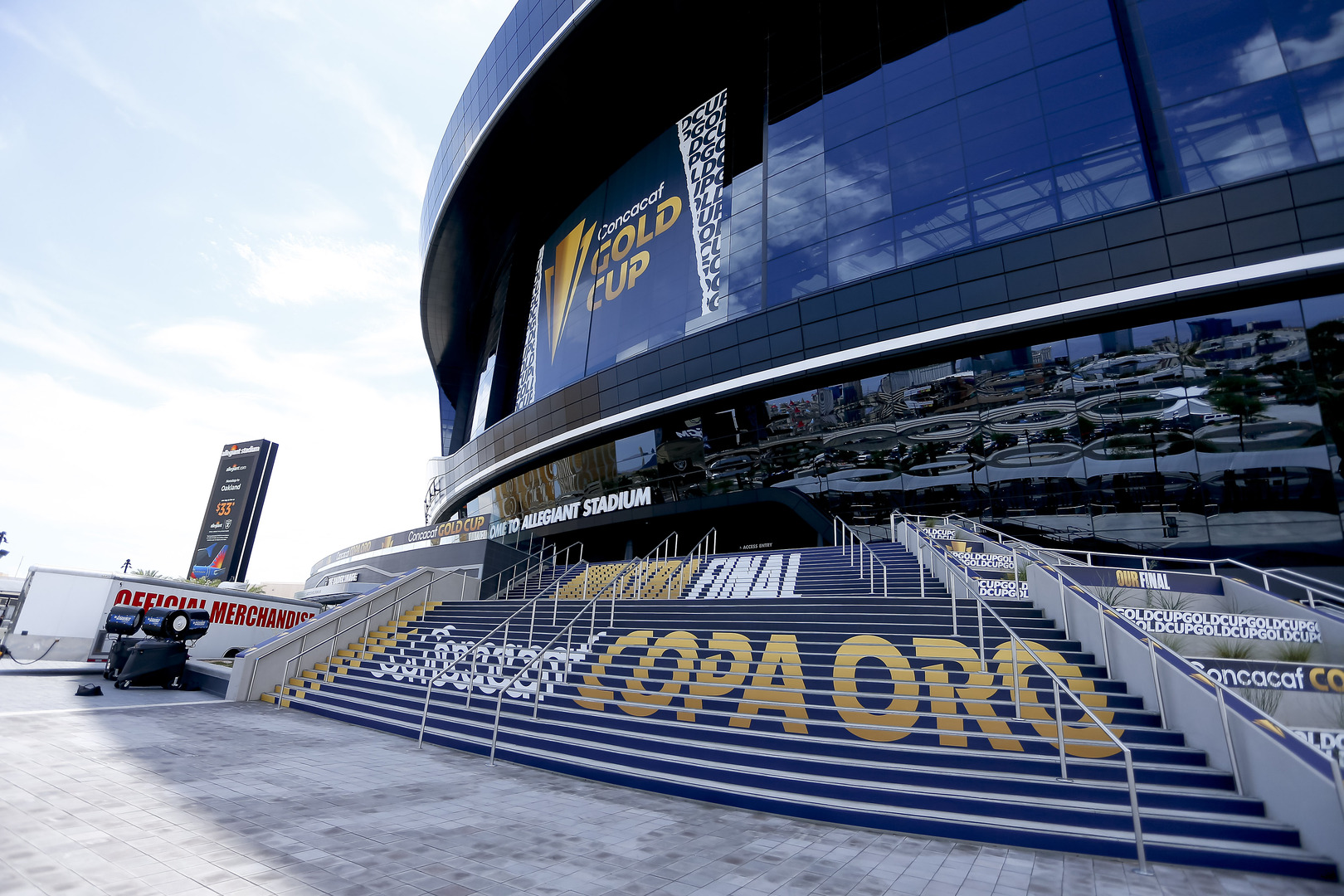
we believed that the Gold Cup brand deserved a font type of its own especially as the stand-out tournament for the federation. Along with an upgrade with more rich blues and powerful gold, we felt that the development of a secondary color palette would allow the brand to celebrate the colors of the 41 nations with vibrancy and flare for a more modern audience and market. What started as a refresh became a significant rebrand, one that looked to the future and one that saw the Gold Cup in a whole new light.

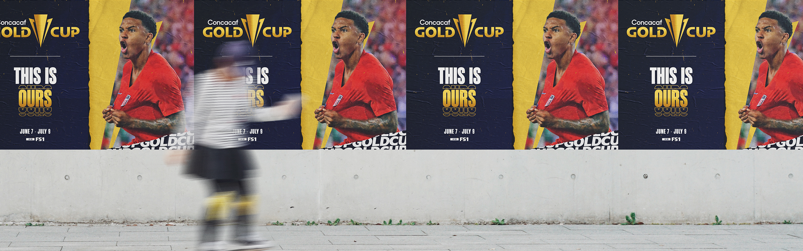


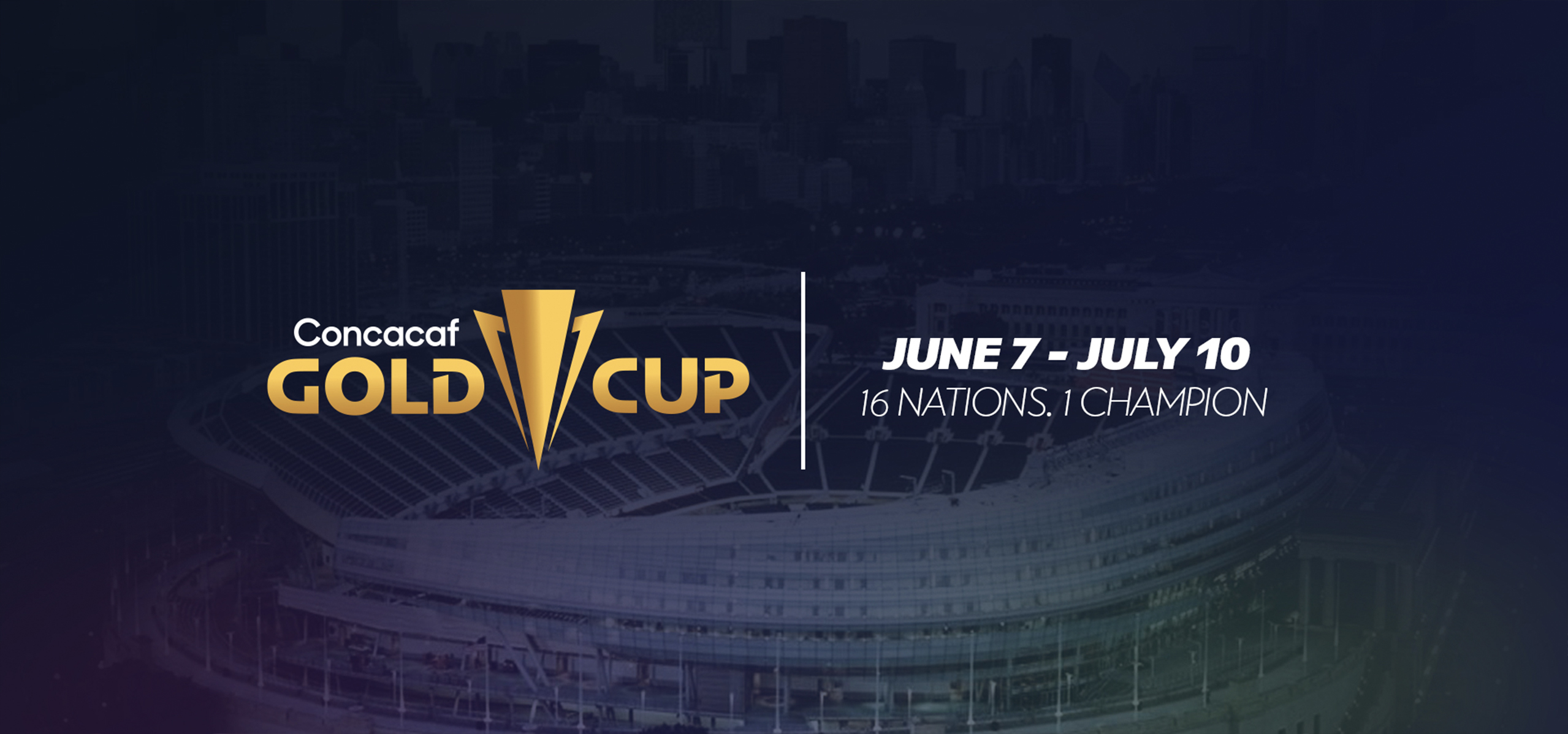
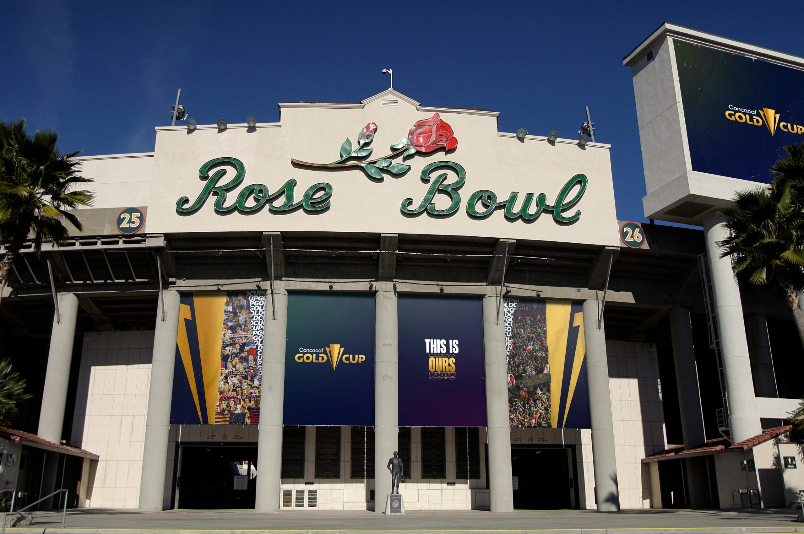
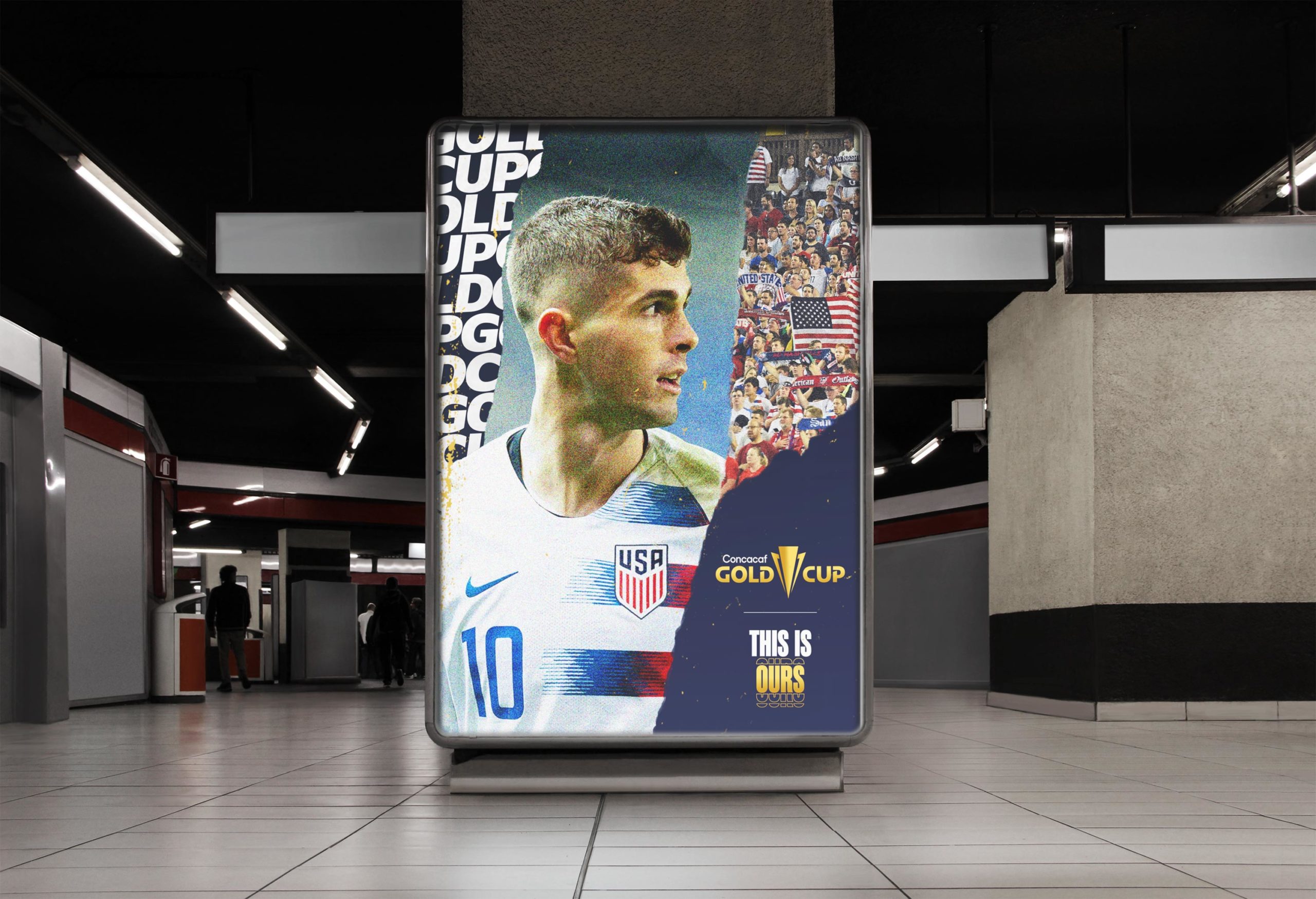
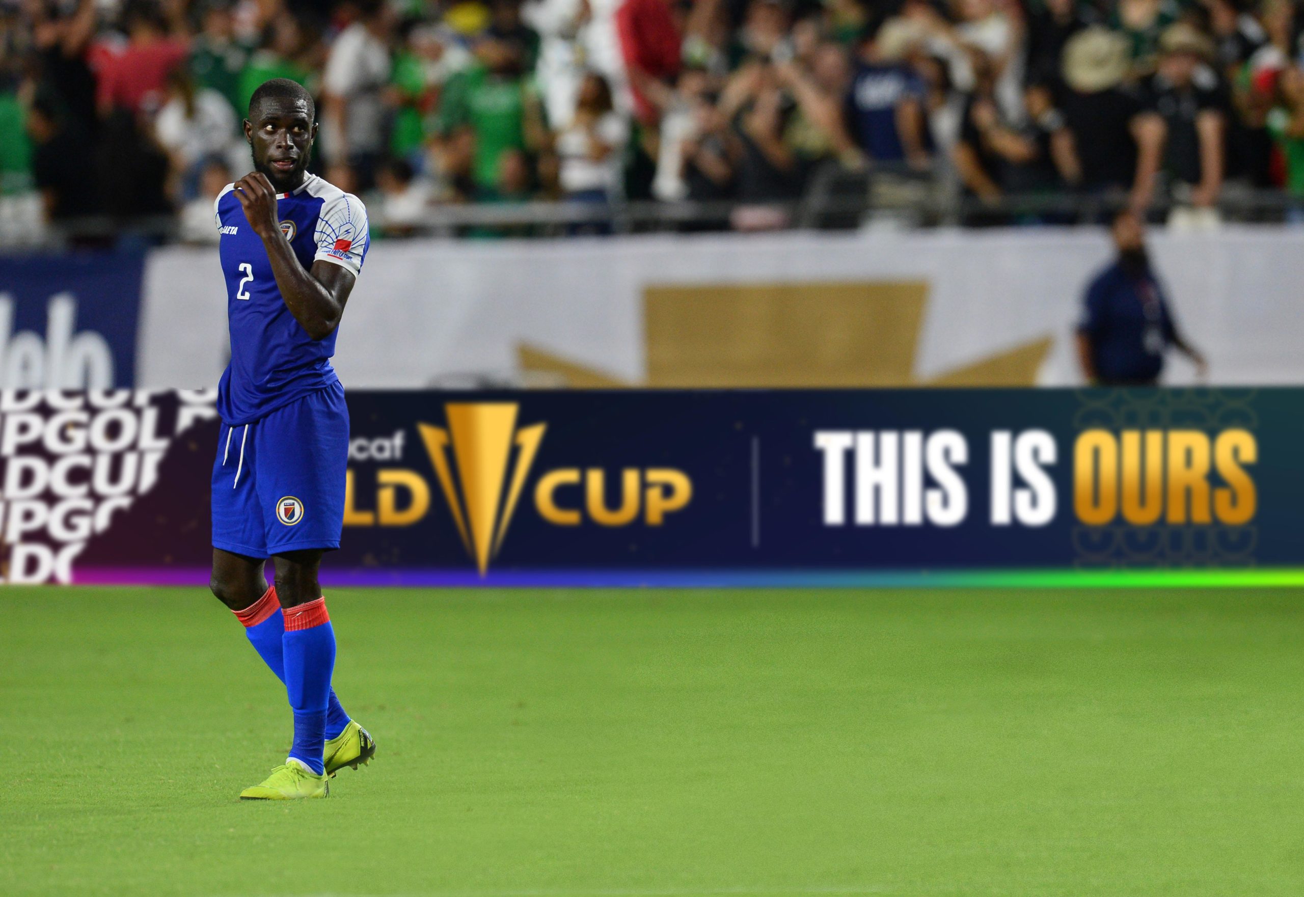
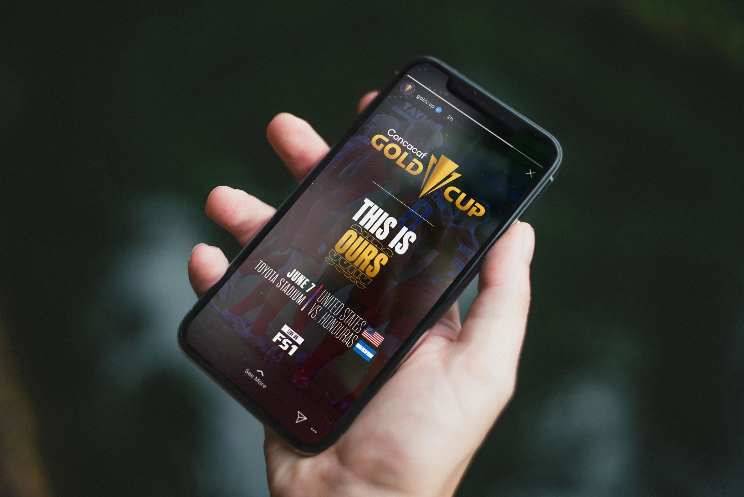
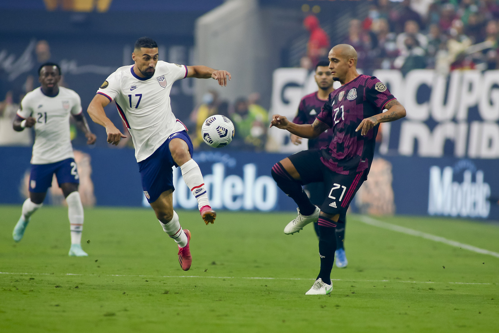
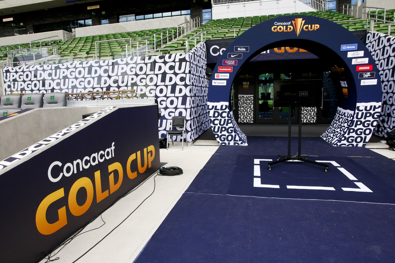
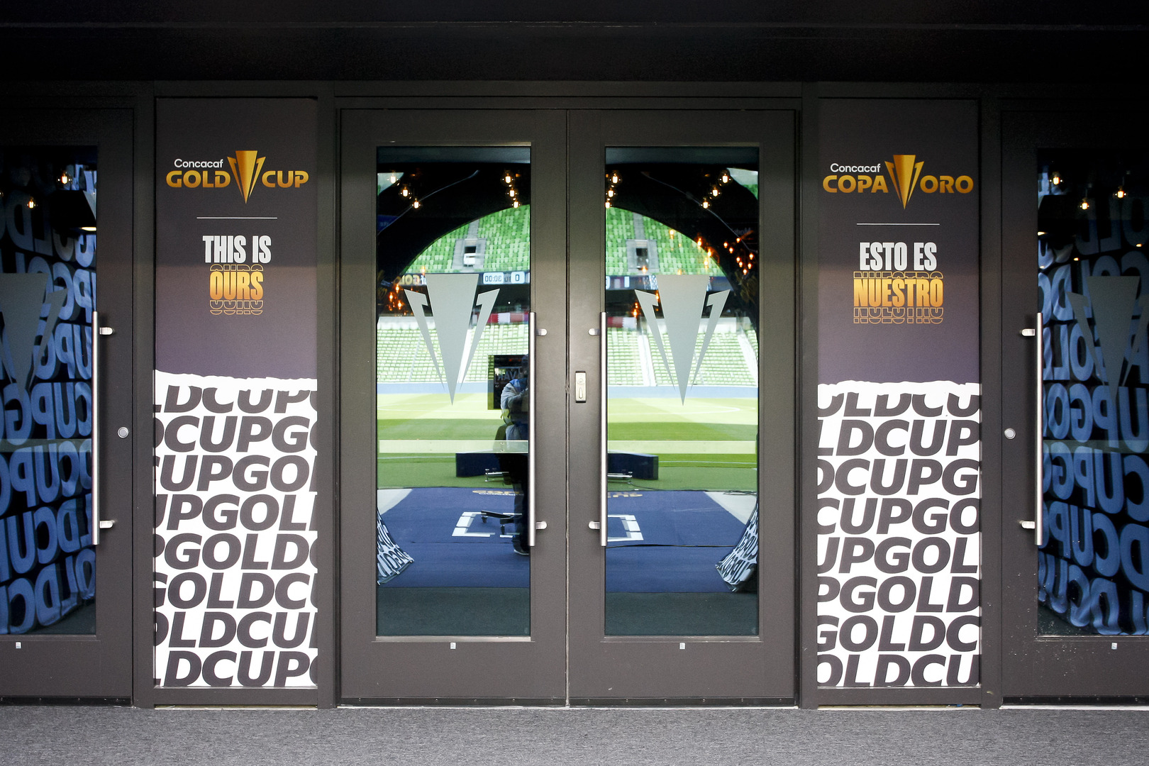
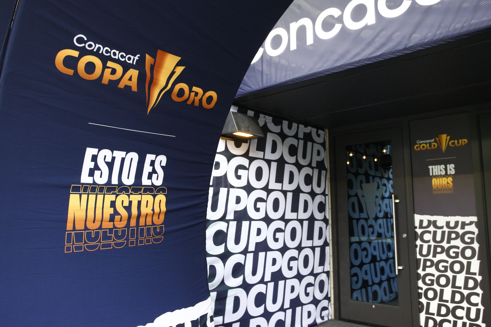
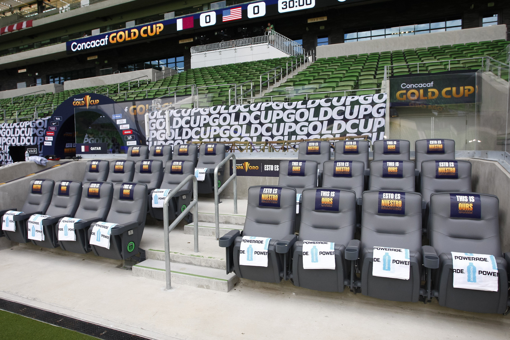
As the top national teams in Concacaf take to the world stage for Gold Cup 2021, pride is the ultimate prize. Pride in representing different cultures and people that make our region unique compared to the rest of the world.“This is Ours” celebrates the Gold Cup as a world-class tournament that unifies fans across 16 proud nations, giving them a unique experience to “own”– to become active participants as their team sets out to bring home the cup. The Gold Cup is for our fans, for our region, for our players, on our soil, and in our neighborhoods. It’s time for us to show the world…


END result.
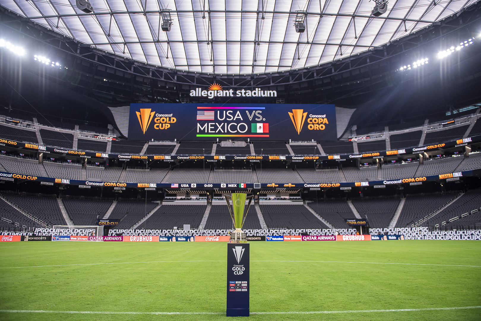
More modern and diverse than ever, the refreshed brand and identity coincide with Concacaf making several football-first enhancements to the format of its flagship competition for the 2021 tournament. Together, they work hand in hand to support the elegance and prestige of one the most prominent soccer tournaments in the world and future growth for generations to come.
PRESS